Tuesday, December 26, 2017

Why mend dad's socks??

I put a new project in Ravelry documenting how i mended one of dad's socks. i've done that before. i have a feeling people wonder why. 

dad's socks are kind of hard to come by. It's hard to tell from photos if socks are really diabetic socks or not. I thought I could recognize the fabric with enlarged stitches in photos, but what I order isn't always exactly what is shipped. Although they are marked diabetic they don't always fit the same or have the same construction. It can be a little hard to judge scale, too. 

this is what i use to keep the hole
from getting bigger
Then there's confusion over what is meant by diabetic socks. By definition they are supposed to be very stretchy so they don't put my pressure or friction on delicate/fragile skin. Special attention is paid to not having bulky or irritating seams. People and sometimes makers and (hopefully not, but maybe even doctors!) mistakenly refer to compression socks as diabetic socks. Those might be used by diabetics suffering edema in relation to other conditions, but they are nearly opposite in function as compression socks are tight to put pressure on the foot and leg. (Usually compression socks are graduated so they are tighter at the toes than at the knee. They are rated for range of pressure they're designed to provide to prevent or reduce swelling.)

it's always a bit confusing when terms disagree.

a sigh of near defeat; facepalm

i really don't remember my blog being quite this complicated to arrange and manipulate, by which mostly i mean putting the pictures and text where i want on the page for each post. in my last post when i tried to align the photos to the left, they only nudged a bit left. thought the medium size might be part of the issue, although i've used larger photos, so i tried small with no difference. haven't yet scrutinized earlier posts to further investigate.

i also noticed that my finished objects and works in progress are not operating. i may turn off the works in progress, bc there are just SO many of them. i suppose i could switch many of them to hibernate in ravelry instead.

when i went to the we <3 progress bars group and another one or two addressing the subject for advice i learned a few things. i think the code for my progress bars is flash, not javascript. it doesn't resemble the coding suggested. i think i added the bars successfully in 2010 following notes that might have dated back to 2007 just like in the forum. when i tried viewing my blog in Chrome instead of Safari, the progress bars displayed as a slideshow. ****oh, wait a minute! maybe what i was calling progress bars is slideshow... i've forgotten so much it's so hard to tell. i seem to recall flash and Safari aren't compatible. but i think i did something to enable it somehow.

not sure how much energy i'll ever have to relearning this and learning more than i knew before. i may just have to settle for struggling to be serene about the few things i can change.

Sunday, December 17, 2017

Claudia's sunset stripes baby cardigan

This is a sweater I'm making for my massage therapist, Claudia. I'm using the Elfin Stripes (Crochet) pattern.Her baby girl is due between Christmas and New Year's Day. Colors coordinate better in person. Was going to use just rose pink and plum mist (bottom stripes), but when I weighed the rose pink I wasn’t sure I’d have enough yarn for both the sweater and hat. Also I was concerned the pairing was too somber or sophisticated for a baby.


So I looked through the other pink yarn choices I had on hand thinking I’d alternate pairs of stripes. When I couldn’t decide I set out the three remaining pinks in order from light to dark. Finally chose the plum to be the only shade for CA and used multiple shades for CB. It’s sort of like a gradient seen thru stripes or bars or a bit like stained glass with dark lead borders. Also makes me think of the way astronomers can detect elements in the atmospheres of planets by viewing the light across the visible spectrum (split up like a rainbow) and observing where the dark bands are present. By noting the color the dark band appears in they identify a gas present.

Based on Ravelry project pics of sweaters with three or more stripe colors, it seems that to visually match the stripe from chest across to the upper arm I should have started with the lightest shade (sirdar click blossom)


This pattern would have been a lot easier with a diagram of how the divided sections would fit together and how to sew the sleeves in. It doesn't give a seam allowance; it would be nice to know how much of the edges the designer had planned for seaming. I followed the advice in others notes and worked the sleeves top down starting from the arm scythes. This made me wish I'd been a little neater with my edges and carrying colors up the side since I was starting with a row of sc over the last/first stitch in each row. Seems I could have crocheted over the very last two or first two stitches with double crochet instead just to neaten up. It all makes me wish I had a baby in front of me to try it on.

This is what the inside left half looked like before seaming the shoulder from front to back and then starting the sleeve. The notch for the neckline is at upper left.
Measured how many stripes fit into 6" on the back section and used that to plan what color would be first. Trying to get the stripes to match up sort of. The shoulder/sleeve seam drops so far down the arm I didn't want to start with pink poodle adjacent to the front/back shoulder seams.

update: waiting for more of the purple (plum mist) yarn to arrive; ETA 12/27. just don't have quite enough to do the cuff, waist and neck ribbing and button bands.


Friday, July 24, 2015

Grammy Dirlam: Free Pattern Alerts

sharing is always good!

came across her blog via a hat pattern offered on craftsy. was trying to figure out how to make up for the pattern being offered for free. managed to stumble across a post she'd made about some of her favorite free crochet patterns. thought this might be helpful to someone somewhere at some time. although my blog has been hopelessly inactive for quite some time, when i clicked on the blogger symbol to share, google signed me right in and had me mid post before i knew what was happening. toward the end of her post she suggests others sharing the links does end up being helpful, so i thought i could at least oblige that. best!

Grammy Dirlam: Free Pattern Alerts: I have been having fun seeking out free patterns to share,  Some of course are mine, Some are from other designers.  All of these are affil...

Friday, July 22, 2011

Dusting off the neglect - with cute undies!

Hi! My name is Dave, maybe.
Finally I have some finished projects to detail. This includes items that are gifts for my sister. Unfortunately two in progress gifts started at earlier times were not finished in time to ship. Oh well. I may debate whether or not to upload the pics at this time. It's Friday now and her birthday is Sunday. With luck her package will arrive on Saturday. That's not a lot of time there to spoil a surprise I suppose. I won't feel the least bit concerned if she opens her box on Saturday. I suppose if she snoops around and sees pics and descriptions here in the meantime she'll either have a short period of happy expectation waiting for her box to arrive or she'll avoid any additional time waiting to be disappointed or unimpressed. Let's move on!


pupils centered
Since I am drawn to quirky personalities and especially quirky patterns with personality (maybe that answers a question if my good friend, Jim, is subscribed to updates) I adore many of the characters depicted in KnitWit: 20 Projects for Beginners and Seasoned Knitters by Katie Boyette. Per my sister's request I had already knit her a sock monster along with several monster sized socks for it to wear. So it seems that an underwear monster is the next thing. If I'd had more time I might have made one or two more monsters, each wearing a different article of clothing.


small eye pinned slightly lower


I found myself torn between aligning the underwear monster's eyes or shifting them. Since Dave (the pattern monster) is shown at an angle to the page I'd gotten used to the sight of him with one eye lower than the other. When I pinned them on with the centers at the same height he just didn't look as cute to me. So I took pictures of him with the eyes pinned each way to decide. Admittedly, the difference is very small anyway.


I also pondered whether or not it was better to sew the eyes on with the white eye color or with the body color. I did the large eye first and used white but felt that the body color would have been a better choice. 


body color yarn attaches
white yarn to attach
one white, one body color

So then I started sewing on the smaller eye with the body color. I think I ended up pulling the yarn tail between the edge of the eye and the stitches attaching it to cover the edge of the eye. Then when I finished the small eye I fished the yarn back to the larger eye and duplicate stitched the body color over the stitches attaching the eye to the body. In the end I concluded that it really didn't matter either way. But originally I'd been very upset by the white attaching stitches seeming like they were in the plane of the body. Because the eyes are so very bulbous that troubled me; there's a chance that tension might have made a difference, but I just focused on whether one color made more sense than the other.


Friday, April 1, 2011

The fourth or sixth time is a charm, I think

Well I've been dragging along with my second llama.  Not sure why overall as I was so looking forward to this adventure.  Perhaps I made it a tedious challenge.  I was just noticing this as I redid the face.  Not sure if the current and final version is the fourth or sixth I've completed, but I'm feeling very sure about it and it is bound off.

The llamas body is only just started, but I improvised what it's going to look like with the body parts that I do have done.  It will be far cuter when I get to the top of the head and the loops that match the colors on the face.


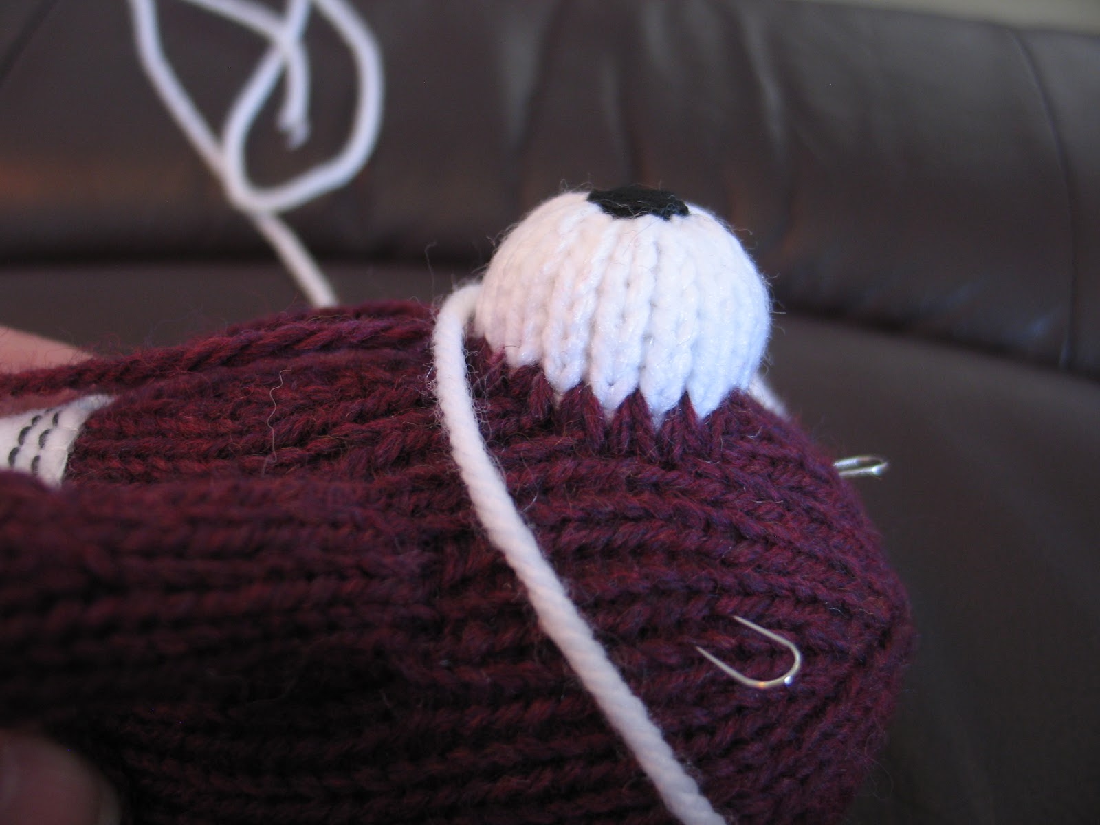
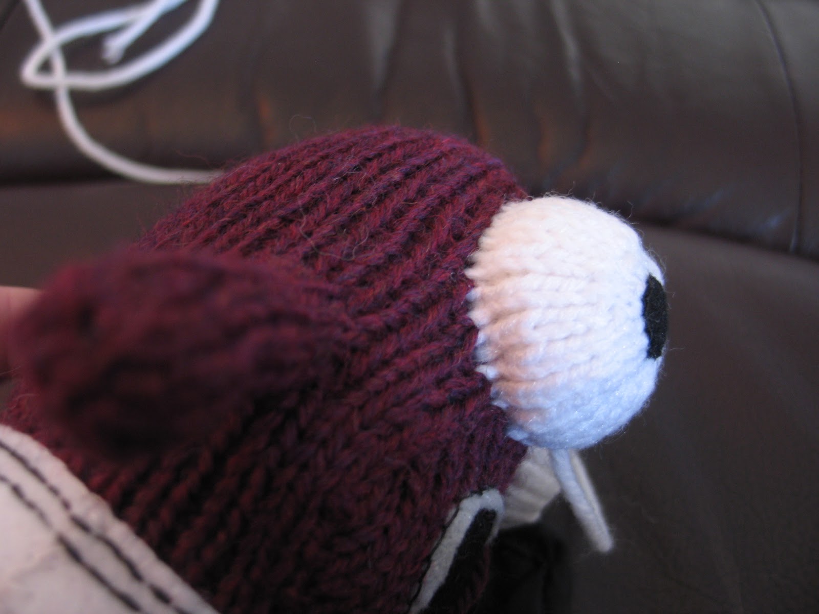
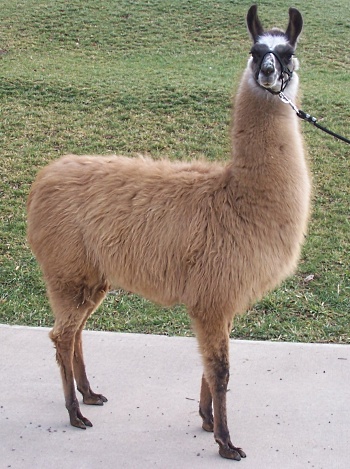
To visualize how the extra colors would look I sampled and painted colors over a snapshot of Frenchy, the first llama. I tried several versions and arrived at the last after realizing that the color that I'd thought was the darkest llama yarn I had wasn't the darkest after all.  Following the coloring I saw on a llama called Macarena, I needed a lighter dark for the loops on the top of the head and a darker dark for the face color around the eyes.  One of the most visible things my new llama is still lacking is a nose and mouth. (Well besides a completed body and also overlooking the fact that the eyes and eyelids are just pinned on.)  For Frenchy I deliberately made her nose with curly nostrils because it seemed so many llama portraits showed sculptural nostrils.  Lately I've been thinking she looks slightly melancholy, so I'm hoping to create a more joyful expression for my new llama.


A very early version of my color/stitch chart

I needed a more precise model for figuring out the actual placement of color on the face, so I ultimately used blocking pins to frame where the color changes should be based on my colored photo and the coloring on the inspiration llama.  I made a chart for myself based on this. I don't know that it's a type or method of chart that anyone else uses, but it made sense to me.  I started with a hand drawn version of ovals arranged in a circle.  Where I needed to make an increase I drew a line through the middle of an oval to make two stitches out of one.  And on the next row there would be an additional stitch as a whole oval.


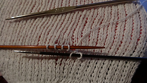
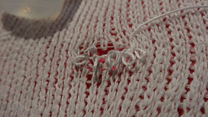
In the end I drew my chart in Illustrator.  I had a variety of oval widths representing the stitches, but that's because each time a stitch was added in a row there would need to be an extra stitch in the next row, making the next row of ovals slightly narrower so they'd fit.  If it weren't so blurry it would be clear how the white/snowball yarn is caught behind the dark yarn when I flipped the face over to purl back.

Wednesday, March 16, 2011

Intarsia in the round face

Pixie Hound
Well I suppose it's not enough to work four legs at a time.  It was a great deal of fun, especially on the 10th when I was sitting in a waiting room at Quest. One of the children sitting nearby said to his mom that I was making a reindeer. Actually the color is perfect for that and the way my circular needles held all the legs together it looked like I might just work all the way up the body that way. I suppose that could be a possibility for a pattern with legs attached like an actual animal like the Pixie hounds and not attached like a doll, like the llama.

http://www.llamalove.com/catalog/escalade08.htm
From here I continued my grand plan for the drama llama llama by attempting to mimic the dramatic color scheme of a few similarly colored llamas.

http://www.oakrestllamas.com/femalesforsale.html
http://www.minnesotaminis.com/lcp/?cat=9


Next I'm focusing on the colors on the face. It's a bit hard to tell, but I plan that the dark brown areas will be under the eyes.  I'm crossing my fingers that it's going to work out okay.  It is intarsia in the round using a technique I learned from the Inside Intarsia with Anne Berk dvd.